


Download the lesson plan in Word or PDF
Download the Food Cards in Word or PDF
Download slides as PowerPoint or PDF
Introduction
Food Production is responsible for approximately one third of all greenhouse gas emissions contributing to global warming. That’s about 19 times the amount from the commercial airline industry! In this lesson, learners will gather and visualise data about the food miles and carbon footprint associated with different food items, critically evaluate this data, and use it to think about how best to reduce the impact of our food systems on the environment.
This lesson is made up of 2 parts as follows:
-
- Data gathering, visualisation, analysis, and discussion (2 hrs)
- Creative activity (1-2 hrs)
Duration: 3-4 hours, which can be split up into 2 or 3 separate sessions
Materials:
-
- Access to computers or tablets with internet
- Food items provided by teacher OR download and print the food cards provided
- For Part 2, any art materials of choice: paper, pencils, felt tips, paint, or digital software (e.g. MS Paint)
Curriculum Links
MNU 2-20a: Having discussed the variety of ways and range of media used to present data, I can interpret and draw conclusions from the information displayed, recognising that the presentation may be misleading.
MNU 2-20b: I have carried out investigations and surveys, devising and using a variety of methods to gather information and have worked with others to collate, organise and communicate the results in an appropriate way.
MTH 2-21a: I can display data in a clear way using a suitable scale, by choosing appropriately from an extended range of tables, charts, diagrams and graphs, making effective use of technology.
TCH 2-02a: I can use digital technologies to search, access and retrieve information and are aware that not all of this information will be credible.
TCH 2-06a: I can analyse how lifestyles can impact on the environment and Earth’s resources and can make suggestions about how to live in a more sustainable way.
TCH 2-11a: I can use a range of graphic techniques, manually and digitally, to communicate ideas, concepts or products, experimenting with the use of shape, colour and texture to enhance my work.
SOC 2-08a: I can discuss the environmental impact of human activity and suggest ways in which we can live in a more environmentally-responsible way.
HWB 2-35a: When preparing and cooking a variety of foods, I am becoming aware of the journeys which foods make from source to consumer, their seasonality, their local availability and their sustainability.
LIT 2-09a: When listening and talking with others for different purposes, I can: share information, experiences and opinions; explain processes and ideas; identify issues raised and summarise main points or findings; and clarify points by asking questions or by asking others to say more.
Learning Intentions
We are learning to:
-
- Find out different factors that contribute to the environmental impact of what we eat.
- Gather and compare data about the environmental impacts of different foods.
- Evaluate the source and quality of the data.
- Draw a conclusion based on the data about what will make the biggest difference in reducing our impact.
- Think creatively about how to do this.
Success criteria
We will:
-
- Gather data using the online calculators.
- Create a visualisation
- Discuss what conclusions we can draw from the data.
- Design a label to show information about the carbon emissions of a food item.
Part 1a – Data Gathering & Visualisation
The teacher can bring a set of 5-10 staple food items into the classroom for this activity (use the food cards for ideas of what to bring). They can be brought from home or bought—as long as you can use them afterwards!—but best to avoid asking the learners to bring items from their own home.
As an alternative, the food cards provided at the end of this document can be cut out and used.
You can break up the learners into groups, or they can work individually. You can also have each group/individual gather data for one food item, then bring them together to pool their data for the visualisation.
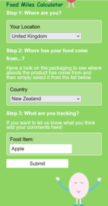
Task 1a: Calculate the food miles of each item using the food miles calculator. If the country of origin is not specified, how might you make an educated guess?
Task 1b: Visualise the data. Three Options:
-
- Order the food cards (or food items themselves) from most to least number of food miles
- Draw a graph using paper and pencil
- Use graphing software or a free online tool such as Kids’ Zone Create a Graph
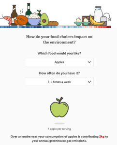
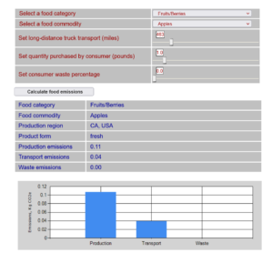
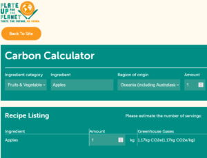
Task 2a: Calculate the carbon emissions for each item. Each student/group can choose one of the three emissions calculators, and then the results can be compared.
Calculator 1: BBC Climate Change food calculator
Calculator 2: Food carbon emissions calculator
Calculator 3: Plate Up for the Planet carbon calculator
Task 2b: Visualise the data.
Optional Bonus Activity:
Task 3a: Use a supermarket shopping website to find out the price per kg of each item.
Task 3b: Visualise the data.
Part 1b – Analysis & Discussion
In this part of the lesson, learners will be prompted to think critically about the source and quality of the data (by digging around on the calculators’ websites to see what further info they can find), interpret what the data means, and make decisions about how to act based on it.
Learners can come up with answers to the questions below individually or in small groups, and then come together to discuss as a class, or the whole activity can be done as a class.
Questions
1. Are the items with the most food miles also the items with the most carbon emissions? If you made graphs, how do the overall shapes compare?
2. How do the different calculators measure carbon emissions? What do they factor in? What is not factored in? Some examples:
-
- Production method, e.g. human labour vs. machinery, pesticides, heated polytunnels
- Land use (including deforestation) & water use
- Processing, packaging & storage
- Different stages of transport
- Home refrigeration & cooking
3. Who made each calculator? Do they have an agenda? How trustworthy are they?
4. If you completed the bonus task, are the most expensive foods also the ones with the most food miles or carbon emissions? Should they be?
Concluding Task
As a class, come up with a list of principles that would help us make more sustainable food choices, and rank these in terms of importance. Some examples might be:
-
- Eat less beef
- Eat more local produce
- Choose food with less packaging.
Part 2 – Creative Activity
The purpose of this activity is to allow learners to be freely creative, and to emphasise that data science and creative arts can in fact be closely linked.
Prompt: Many food labels tell us the country of origin, but not the other contributing factors to carbon emissions. Design a food label that would give shoppers an accurate sense of the carbon emissions associated with the different foods we eat.
© Data Education in Schools, University of Edinburgh, 2024. This resource is licensed CC BY-NC 4.0, unless otherwise indicated.